Case Study
Queenstown Airport Rebrand 2022

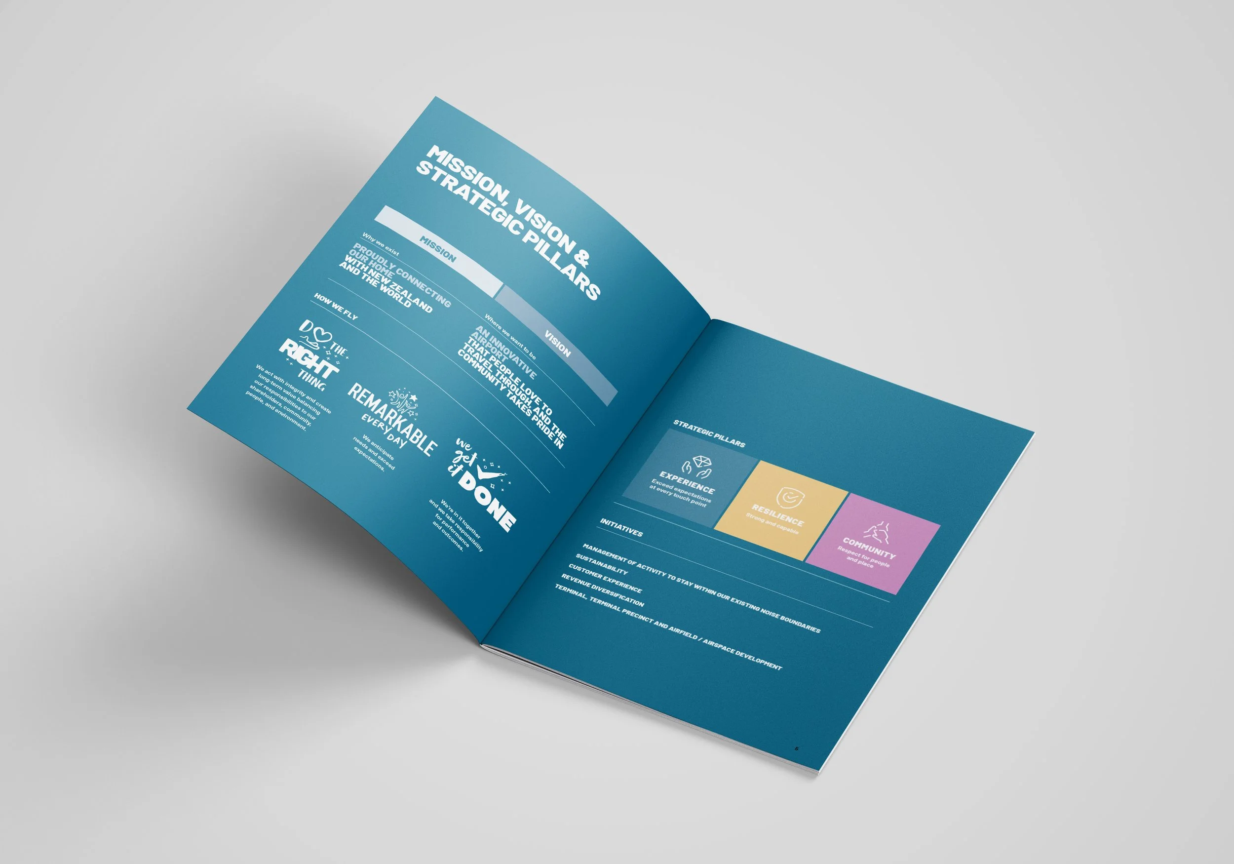
In 2022, Tracy James Creative was tasked with creating a new brand strategy and visual identity for Queenstown International Airport in New Zealand. The project began with defining the airport’s vision, mission, values, brand personality, and unique positioning—setting the stage for a refreshed identity.
The new visual identity features vibrant colours drawn from the region’s stunning natural palette, along with bold typography and descriptive "word blocks" to strengthen the airport’s voice. Emotive photography, custom illustrations, graphic elements, and iconography come together to present a dynamic and confident image, ensuring the airport stands out on the global stage.
We developed the tagline, “Remarkable Starts Here,” to embrace the word remarkable as a key differentiator for the region and everything it represents. Nestled in the Remarkables Mountain Range, Queenstown is a place where journeys begin. The phrase “starts here” not only ties into the geographic and travel references but also speaks to the exceptional experience awaiting visitors from the moment they arrive until they depart. From awe-inspiring views and warm, welcoming service to boutique food, beverage, and shopping experiences, Queenstown Airport offers something remarkable at every step.
While the new logo will be revealed in 2025, we also created an updated lockup for ZQN as part of the brand suite, with a simplified interim logo standing in for the old one.

The ZQN lockup is used within the terminal as a lightbox or frame for both still and moving images of the region.
Team Values:


Collateral Rollout
As part of the collateral rollout we produced documents such as the Annual Report, Sustainability Strategy, Ten Year Strategy and Statement of Intent.


Photography is more emotive and engaging and filled with warmth and light. A subtle ‘Koru’ graphic with a glinting rainbow effect or in semi transparent white, watermarks hero images and is used as a key element on many layouts.

The “word block” as seen on the right hand page is a strong brand element using the bold brand typeface to draw attention to key messages.

Wayfinding, Signage & Vehicles
The brand identity carries through to terminal interiors and exteriors in signage and vehicles. The terminal interiors were redesigned with warmer, more natural and inviting colours, textures and materials, helping to create a sense of place.
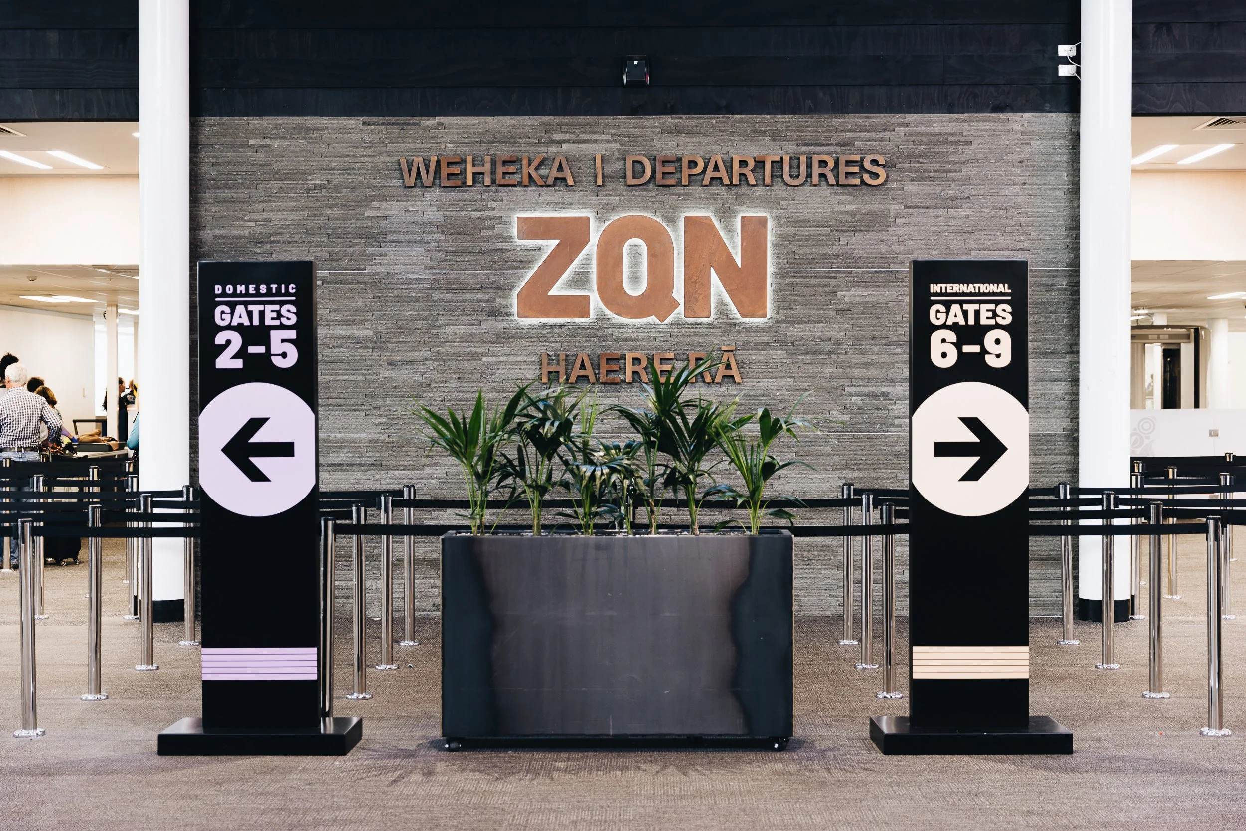
The ZQN lockup in action along with new look signage and wayfinding and the integration of warmer, natural materials.

Vehicles, shuttle bus shelters and outdoor signage have all been updated.

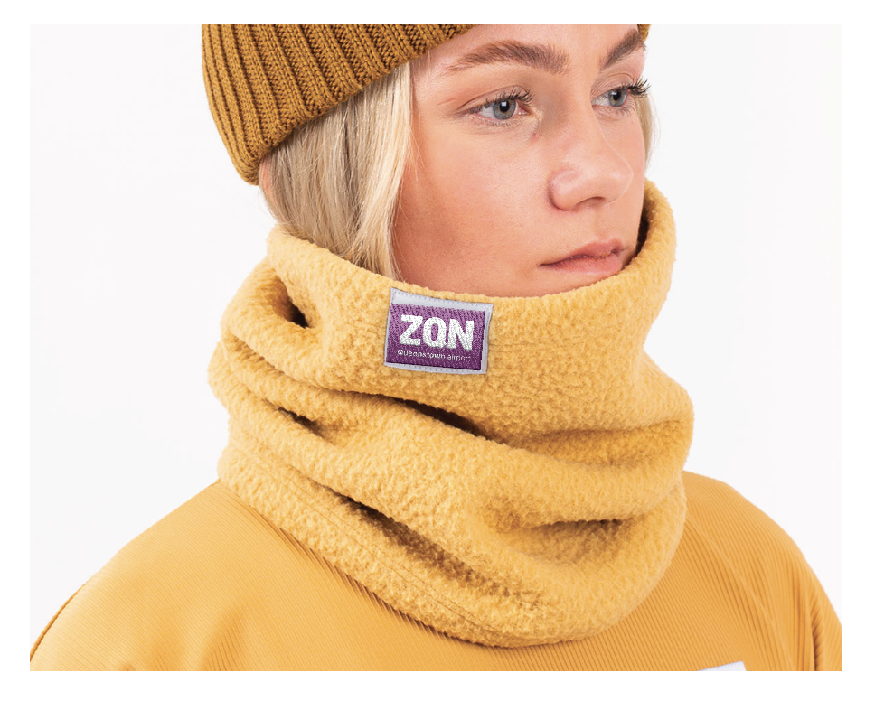
Uniforms and Apparel
The brand identity plays out beautifully in uniforms and apparel – from silk scarves and ties using the koru motif teamed with shirts, jackets and chinos; to t-shirts, gilets, outerwear and headgear for practical outdoor wear.